A marketing team, a managed OpenSearch cluster, and one deceptively simple request: "show me email_open / email_sent as a percentage, per campaign offer, for any time range I pick." Counts were easy. The ratio was not.
musth.io tracks email marketing events—sent, open, hlo, link redirect—into daily analytics indices. The events were flowing; the dashboards were not answering the question. Here is how we got dynamic ratio tables out of OpenSearch Dashboards, what the mapping told us along the way, and where Kibana Lens entered the conversation. Only numbers from the evidence pack, as always.
Quick answer: OpenSearch Dashboards cannot compute a dynamic percentage between two event counts in a standard table—only precomputed ratios, which kill the dynamic time range. We solved it twice: a TSVB table with a Filter Ratio aggregation (event.name: "email open" over event.name: "email sent", grouped by offer name), and a custom Vega table with formula transforms, descending ratio sort, and pagination. We also flagged the migration path: Kibana Lens computes the same ratio natively. Along the way we found 19 campOfferName fields in the mapping with only 3 active, and offers whose opens exceeded recorded sents—a tracking gap, not a math bug.
Challenge
The setup was small and honest: a SaaS-managed OpenSearch cluster, 3 nodes with all roles, 4 GB memory and 2 GB JVM heap each, 20 GB total disk at about 25% usage. Data is create-only—no updates—written into a daily index (musth-analytics-%{YYYY-MM-DD}) with a 30-day delete policy. No scale drama here; this is a modeling and visualization problem.
The first milestone, in the client's own words: a table showing % metrics for email_open/email_sent per campOfferName (temporarily email_open/email_hlo for the POC), plus click+redirect/email_sent per offer. Example offers from the notes: "Number One Coin", "EFIR Neuralink".
The blocker: OpenSearch Dashboards happily shows email open and email sent counts side by side, but it cannot divide them dynamically. If you precompute the percentage at ingest, the time picker becomes decorative—you can no longer ask "last 24 hours" vs "last 30 days" and get a live ratio.
Diagnosis
One logical field, nineteen mapped fields
Before building anything, I checked what campOfferName actually meant in the index. The mapping ("dynamic": "strict", almost everything keyword) contained 19 distinct campOfferName fields. Only 3 carried data: event.campOfferName, context.event.campOfferName, and visible.campOfferName (nested). The other 16—clicked.*, submitted.*, ref.*, endpointStart.*, sessionStart.*, userStart.* variants—were empty.
The two active top-level fields overlapped heavily: out of 75,471 documents in musth-analytics-2024-*, 70,463 had event.campOfferName and 70,985 had context.event.campOfferName, with almost identical values. That comparison decided which field the visualizations group on—guessing wrong here means silently dropping thousands of documents from every ratio.
Opens greater than sends
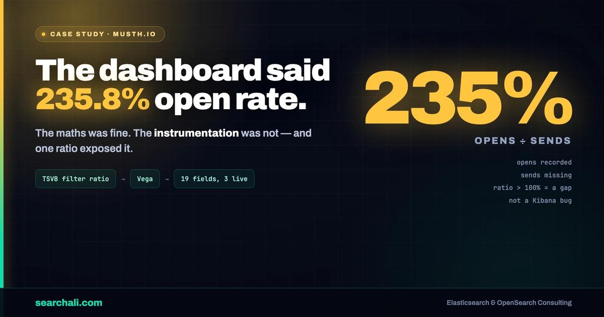
A terms aggregation per offer with event.name sub-buckets exposed a data-quality fact worth more than any chart: some offers had email sent recorded (one offer: 28,904 sent / 798 open), while others had thousands of opens and no sent bucket at all (one offer: 6,241 opens, zero sent events). On the dashboard this showed up as an Email Ratio of 235.8% for "EFIR Neuralink" (500 sent, 1,179 open). The ratio math was right; the email sent instrumentation simply did not cover every offer. That is a finding you want before the marketing team trusts a percentage column.
Solution
TSVB Filter Ratio: the native answer
OpenSearch Dashboards inherits TSVB, and TSVB has the exact aggregation this problem needs: Filter Ratio. The table visualization was configured as:
- Group by field:
event.campOfferName, up to 1000 rows - Metric: Filter Ratio — numerator
event.name: "email open", denominatorevent.name: "email sent", metric aggregation Count - Extra columns for raw Email Sent and Email Open counts, so the ratio is always verifiable at a glance
This gives a fully dynamic ratio: change the time picker, the percentage recalculates. One limitation is baked into the panel title we shipped—"Email Ratio (Sorting Disabled)". TSVB tables cannot sort by the computed ratio column.
Vega: sortable ratios with pagination
For the sortable version, I wrote a Vega spec against musth-analytics* using context.event.timestamp as the time field. The data pipeline inside the spec:
"aggs": {
  "by_offername": {
    "terms": { "field": "context.event.campOfferName", "size": 1000 },
    "aggs": {
      "hlo_count":  { "filter": { "term": { "event.name": "email hlo" } } },
      "open_count": { "filter": { "term": { "event.name": "email open" } } }
    }
  }
}
A formula transform computes hlo_count / open_count per bucket, a collect transform sorts descending by ratio, and a window/filter pair implements client-side pagination (20 rows per page with prev/next controls drawn as Vega marks). It respects the dashboard time range and filters via %context% and %timefield%—so it sat on the same dashboard as the TSVB panels, filtered to one offer, showing 2.036% where TSVB's hlo/open variant showed 1.442% over its own column layout.
The Lens escape hatch
The notes also document the honest alternative I tested: in Kibana, Lens computes email_open/email_sent dynamically out of the box—last 24 hours, last 30 days, whatever the picker says. If ratio-style KPIs multiply, migrating this workload to Elasticsearch removes the workaround entirely. For teams staying on OpenSearch, TSVB + Vega covers it; the trade-off is maintenance of a hand-written spec. (For the TSVB side, the OpenSearch dashboards documentation covers the available visualization types.)
Mapping hygiene as a deliverable
The 19-vs-3 field finding became its own recommendation: with dynamic: strict already enforced, the 16 dead campOfferName fields are pure template debt—every one is a chance for a future visualization to aggregate on an empty field. Consolidating on context.event.campOfferName (the field with the best coverage) keeps every chart on one source of truth.
Results
Only what the evidence supports:
| Result | Evidence |
|---|---|
| Dynamic open/sent ratio per offer, native | TSVB Filter Ratio table, group by event.campOfferName, 1000 rows |
| Sortable + paginated ratio table | Vega spec: formula transform, descending sort, pageSize 20 |
| Field choice backed by counts | 70,985 vs 70,463 of 75,471 docs on the two candidate fields |
| Mapping debt identified | 19 campOfferName fields, 3 active, 16 empty |
| Tracking gap surfaced | Offers with opens and no email sent events; 235.8% ratio explained |
| Cluster envelope documented | 3 nodes, 4 GB/2 GB heap, 20 GB disk ~25% used, 30-day retention |
No invented KPIs: the source pack contains no open-rate improvements, cost figures, or latency numbers, so none appear here.
Key Takeaways
- "Show me a percentage" is a modeling question. Counts aggregate; ratios need Filter Ratio (TSVB), a Vega formula, or Lens—decide before promising a dashboard.
- Verify which duplicate field actually has coverage. A doc-count comparison between
event.*andcontext.event.*chose our group-by field; guessing loses documents silently. - Ratios above 100% are instrumentation findings. Opens without recorded sents mean the denominator is incomplete—fix tracking before tuning charts.
dynamic: strictdoesn't clean old templates. 16 of 19campOfferNamefields were empty; prune the template, not just the incoming docs.- Vega buys sorting and pagination that TSVB can't do—at the cost of a spec someone must maintain. Keep both panels until the team picks one.
- Know your escape hatch. Kibana Lens does dynamic ratios natively; if KPI dashboards are the product, factor that into the platform choice.
If your marketing or product analytics live in OpenSearch and the dashboards can't answer ratio questions, this is a solved problem—see how I approach cluster and dashboard work at searchali.com/en/monitoring.
Need dashboards your team actually trusts? → searchali.com